Welcome to Just Two Things, which I try to publish daily, five days a week. Some links may also appear on my blog from time to time. Links to the main articles are in cross-heads as well as the story.
#1: Hacking IKEA
IKEA isn’t so much a furnishings company as a home platform. What I mean by that is that it is ubiquitous, and that its designs across the world are broadly standardised. As The Hustle magazine pointed out:
Ikea is kind of like the Bitcoin of furniture: the company uses universal designs, meaning its hardware and measurements are uniform across most of the developed world.
The result of all of this is that there’s a burgeoning industry around upcycling IKEA furniture. This is known as ‘IKEA hacking’: “any form of upgrading, customizing, repurposing, or personalizing a piece of stock Ikea furniture.”
(Source: The Hustle)
The notion goes back to the mid-2000s, when popular websites such as IKEA Hackers (the clue is in the name) started to publish instructions on how to customise IKEA furniture.
At the time IKEA wasn’t so keen on this—lawyers got involved. Now every social media platform is swarming with advice on how to hack IKEA’s furniture. The Hustle has some eye-popping statistics:
TikTok: 64m views on #ikeahacks videos
Instagram: 500k posts tagged with #Ikeahack
Facebook: hundreds of Ikea hacking groups with more than 1m collective members
YouTube: thousands of Ikea hack videos with 100m+ views
Pinterest: an endless scroll of DIY Ikea projects
Reddit: r/Ikeahacks boasts 76k subscribers and has grown 400% in the past 5 years.
There’s more in The Hustle article than you really need to know on the subject, unless you’re thinking of hacking some IKEA furniture yourself.
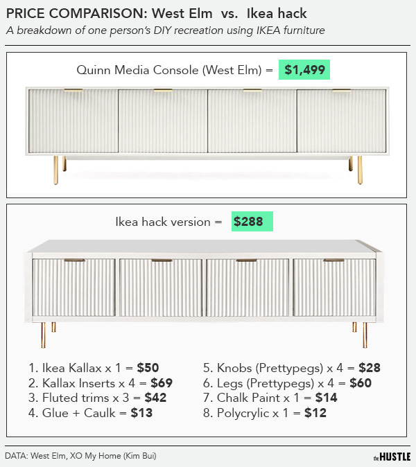
But the ecosystem of small businesses offering customised add-ons to IKEA furniture is striking, many using Etsy as a platform. Perhaps unsurprisingly several of them are based in Sweden. And the cost-differences between a little bit of hacking and buying a more upmarket item are striking, as in this example.
(Source: The Hustle)
And perhaps one of the reasons that IKEA is more relaxed about all of this these days is that in the early 2000s, it was more concerned about selling more and more furniture. These days it’s also concerned about environmental impact—appropriately so for a business that gets through 1% of the world’s wood supply.
There’s some evidence that upcycling furniture extends its life—and acts as a bit of an antidote to ‘fast furniture’. As the article notes, “Each year, Americans discard 20m tons of furniture — a figure that has doubled in the last decade.” One of the companies in the ‘hacking’ ecosystem has research that says that upcycling a piece of furniture extends its life by 20%.
There’s a whole bunch of trends coming together: the pleasure of a bit of personalisation; a bit of light-touch ecological awareness; the sense of getting a bit of a bargain; a bit of corporate purpose. None of them are that strong, but together, they’re enough to keep the idea of hacking IKEA going for a while.
#2: IBM’s workplace posters
In the 1960s and 1970s, the computer company IBM—at the time the largest business of its kind in the world, by some distance—had an internal design department based on its site in Boulder, Colorado. Much of its work was on internal communications, at a time when much workplace communications was on a scale from haphazard to non-existence.
IBM was ahead of the curve in having a clear corporate identity, supervised by Paul Rand, and this extended into the posters the group produced for internal messaging. Design Observer has an extract from a new book, The IBM Poster Program.
Influenced by Paul Rand’s creative direction over IBM’s corporate identity, staff graphic designers Ken White — who had studied under Rand at Yale University— John Anderson, Tom Bluhm, and photographer Rodger Ewy developed posters as a platform for elevating internal communications and initiatives within the company. While daily tasks for corporate graphic designers often included layout work on newsletters, binders, symbols, booklets, and brochures, the visually clear, single-message format of the poster offered a unique creative outlet and latitude for experimentation.
(Source: The IBM Poster Program. The poster at the bottom left is a reminder to keep the lids on cups.)
The designers used screenprinting and lithography, which were leading edge at the time:
Each poster was designed within a Root 2 (15 × 21 in) format, and painstakingly produced, using screen printing by a small printshop operated by Fred Jurado, or offset lithography by Frederic Printing — both in Denver, Colorado. Posters were then shipped to multiple locations to be displayed in hallways, conference rooms, and cafeterias throughout IBM campuses. Subject matter included everything from encouraging equal opportunity policies, to reminders on best security practices, to promoting a family fun day.
(Source: The IBM Poster Program. The botom left poster is about internal security, of course.)
What’s striking for me about these posters is the design is outstanding, and some seem at the leading edge of corporate behavious at the time—there’s a poster promoting equal opportunities in the book. But they are in a style that would be completely alienating now, and not just because they reflect IBM’s white male culture. It’s a useful note of how far corporate values have shifted in the last 50 years, in all but the most strait-laced and hierarchical of businesses.
j2t#127
If you are enjoying Just Two Things, please do send it on to a friend or colleague.


